
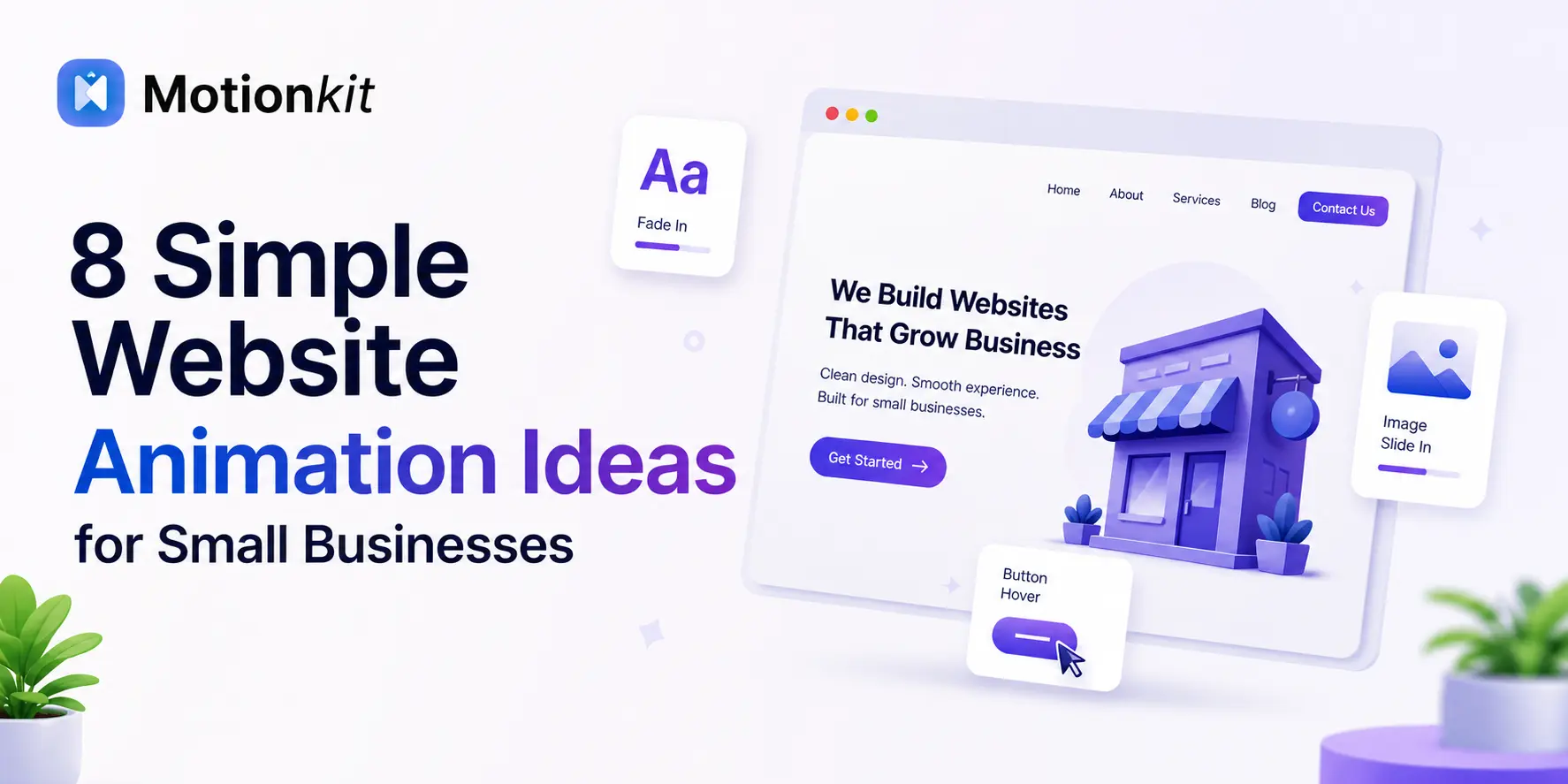
Your small business website has only a few seconds to make a good impression. After that, most visitors move on.
A good design helps, but movement is what keeps people interested. Small and thoughtful animations can make your website feel alive. They guide visitors to the right sections and make your brand look clean and professional.
The good news is you do not need to be a developer to add animations. You also do not need to redesign your whole website. Even a few simple animations can make a big difference in how visitors experience your site.
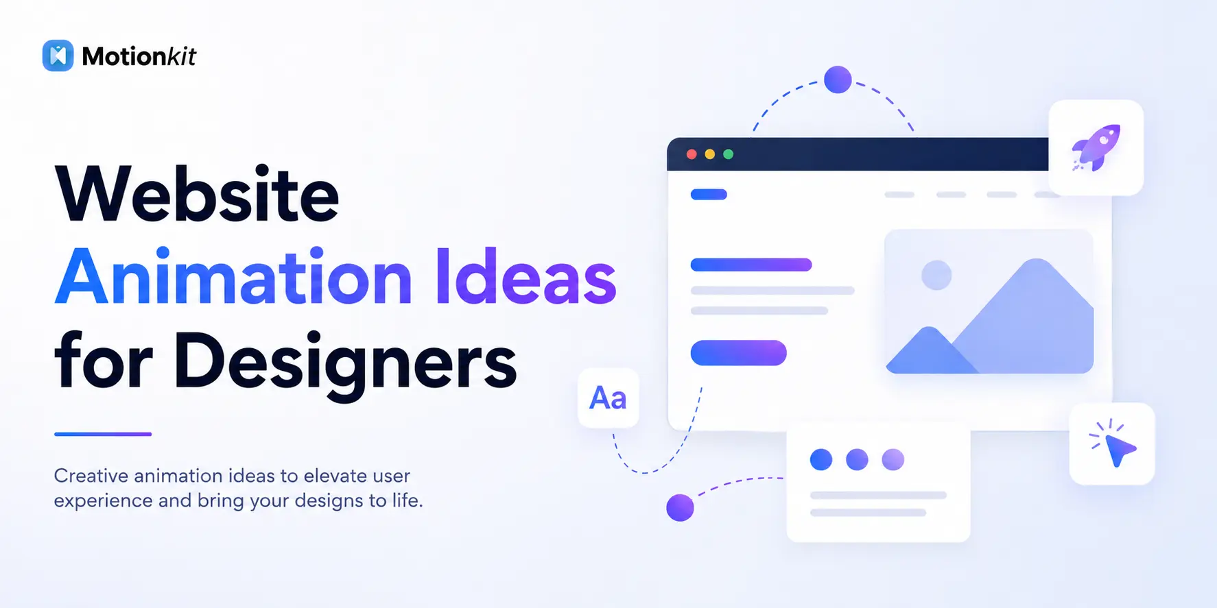
In this article, you will find easy and practical animation ideas for small businesses. Everything is explained clearly without any technical terms.
What Are Website Animations?
Website animations are movements that happen on your site. For example, a button can change color on hover, a section can slide into view as you scroll, and a heading can fade in when the page loads.
These are all forms of animation. They are not videos or flashy effects. They are small and controlled movements that make your website feel more interactive and modern.
Think of it this way. A static website is like a printed brochure. An animated website feels more like a friendly conversation. One simply sits there, while the other responds to you.
8 Website Animation Ideas for Small Businesses
Here are specific ideas you can use, no matter what kind of business you run.
1. Fade-In Sections on Scroll
As visitors scroll down your page, each section gently fades into view. This is one of the most popular animations used on websites today, and for good reason. It feels clean and modern, and it guides the visitor through your content naturally.
Good for: Service pages, about pages, landing pages
2. Hover Effects on Buttons
Moving the cursor over a button makes it change. The color may shift, it may grow slightly, or it may underline. This small response tells the visitor that it is clickable.
Good for: Contact buttons, booking links, “Get a Quote” CTAs
3. Sliding Text or Headlines
Instead of your headline just sitting there, it can slide in from the left or right when the page loads. This creates an immediate sense of energy and professionalism right at the top of your site.
Good for: Hero sections, homepage headlines
4. Scroll-Triggered Counter Animations
If you have numbers on your website, such as years in business, happy customers, or projects completed, make them count up as the visitor scrolls to that section.
It is a small touch, but it makes those stats feel more meaningful and engaging.
Good for: About pages, trust sections, service pages
5. Image Zoom on Hover
When a visitor hovers over a product image or portfolio photo, it gently zooms in. This gives the impression of depth and interactivity without being distracting.
Good for: Portfolio sites, product showcases, restaurant menus with photos
6. Parallax Scrolling on Backgrounds
A parallax effect means the background image moves at a slightly different speed than the content in front of it as you scroll. It creates a subtle 3D feel that makes the page look more dynamic.
Good for: Hero sections, testimonial backgrounds, service banners
7. Animated Loading Screens
A simple branded animation while your page loads sets a tone before the visitor even sees your content. It can be as simple as your logo appearing with a gentle fade.
Good for: Any business that wants a more polished first impression
8. Accordion and Expand Animations
When someone clicks on a FAQ question or a service description, the answer expands smoothly rather than snapping open. This keeps the page tidy and the experience smooth.
Good for: FAQ sections, pricing pages, service detail pages
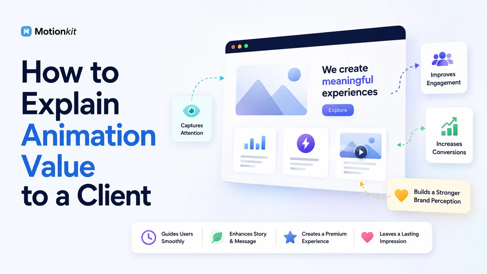
Best Practices for Using Animations on Your Website
Animations can improve how your website feels and how users interact with it. But if you use them the wrong way, they can hurt performance and user experience.
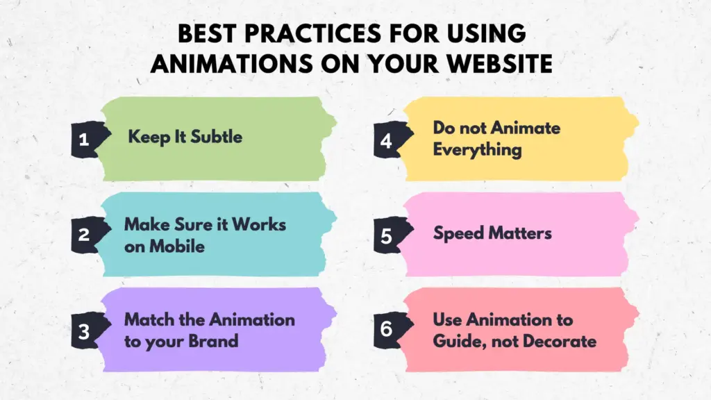
Keep It Subtle
Animations should support your content, not distract from it. If the movement is the first thing someone notices, it might be too much. Use soft effects like fade, slide, or small hover movements so users focus on your content first, not the animation.
Do not Animate Everything
Pick 2 to 4 key animations and use them consistently. A page where every element is moving becomes exhausting to look at. Focus only on important sections like headings, buttons, or product highlights so users know where to pay attention.
Make Sure it Works on Mobile
Most of your visitors are on their phones. Test animations on a mobile screen before going live. Avoid hover-based effects and heavy interactions. Make sure everything runs smoothly without lag on smaller devices.
Speed Matters
Heavy animations can slow down your page. Choose lightweight effects that do not affect your load time. Fast websites keep users engaged, while slow animations can increase bounce rate and hurt your SEO.
Match the Animation to your Brand
A law firm and a kids’ toy shop should use very different animation styles. Keep it appropriate for your audience. Clean and simple motion works better for professional brands, while fun and playful animations suit creative or casual businesses.
Use Animation to Guide, not Decorate
Every animation should have a reason. It can draw attention, confirm an action, or reveal content in a logical order. Animations that help users understand what to do next improve the overall experience instead of adding visual noise.
4 Common Mistakes to Avoid
Animations can improve your website, but small mistakes can quickly ruin the user experience. Avoiding these common issues will help you create a smoother and more professional design.
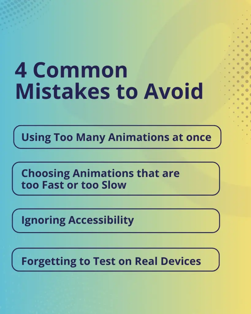
Using Too Many Animations at once
When everything is moving, nothing stands out. It feels chaotic instead of polished. Start with one or two animations and build from there.
Focus on key areas like headings, important sections, or call to action buttons so users can clearly understand where to look. Too many effects at once can confuse users and make your website feel unorganized.
Choosing Animations that are too Fast or too Slow
An animation that zips by in a blink feels glitchy. One that crawls feels broken. Aim for smooth, natural timing, usually between 0.3 and 0.8 seconds. Good timing makes your interface feel responsive and comfortable.
If animations are not balanced, users may miss important information or feel frustrated while navigating your site.
Ignoring Accessibility
Some visitors are sensitive to motion. Using animations thoughtfully and not making them the only way to access content keeps your site usable for everyone.
Always ensure important information is visible without relying only on animation, and avoid strong or continuous motion that may cause discomfort. Accessible design builds trust and reaches a wider audience.
Forgetting to Test on Real Devices
What looks great on a desktop may be choppy or broken on a phone. Always check animations across different screen sizes before publishing.
Test on mobile, tablet, and slower devices to make sure everything runs smoothly. Proper testing helps you catch performance issues early and ensures a consistent experience for all users.
Conclusion
Animations are a simple way to improve a small business website. They make your site look more professional, help visitors understand your message faster, and guide people toward the actions you want them to take.
You do not need a big budget or a developer to get started. Begin with one or two simple ideas, such as a fade in effect on your service section or a hover effect on your main button. See how it feels, then build from there.
The goal is not to impress people with motion. It is to make their experience smoother, more enjoyable, and easier to remember. That is what good animation does.
FAQs
Do I need a developer to add animations to my small business website?
Not anymore. Many tools today let you add animations through a visual editor without writing code. If you use WordPress, there are plugins that handle this for you.
Will animations slow down my website?
They can, if they are poorly built or used too much. Lightweight animations, such as fade ins and hover effects, have very little impact on page speed when done correctly.
How many animations should I use on one page?
A simple rule is to use about 2 to 4 animations on a page. Place them in important areas like the hero section, your main call to action, and one or two key sections. Adding too many can make the page feel overwhelming.
Are website animations good for mobile users?
Yes, as long as they are tested on mobile. Some animations look great on desktop but feel clunky on a phone. Always preview your site on a mobile screen before publishing.
Leave a Reply