
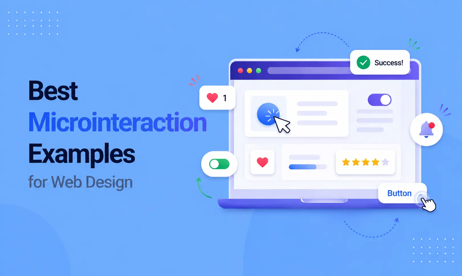
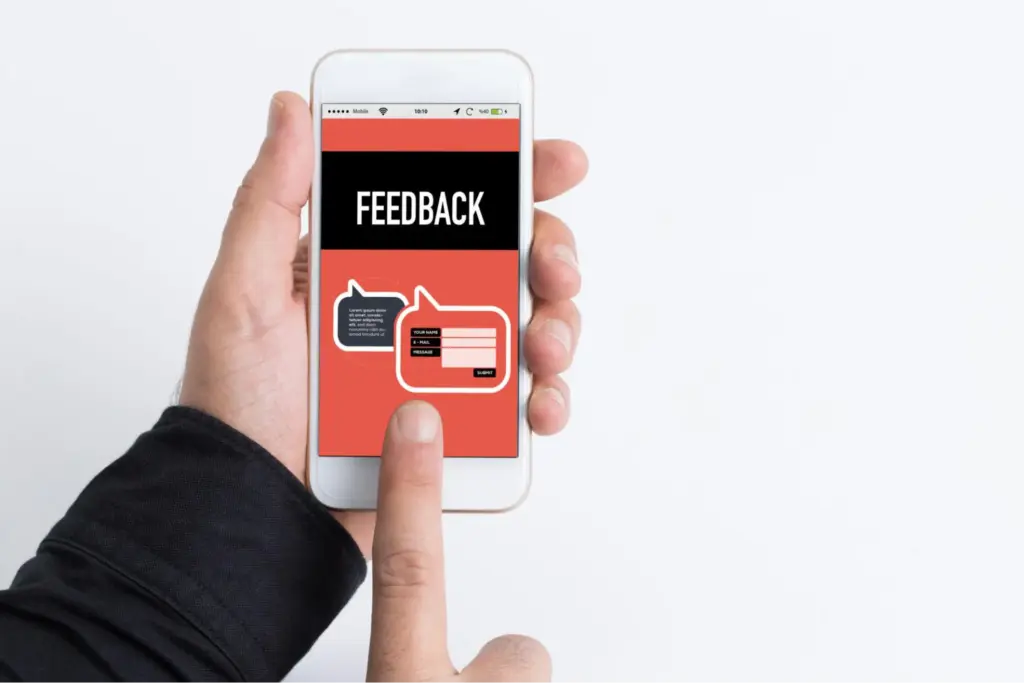
Think about the last time you clicked a button, and it gave a little bounce. Or you filled out a form, and a green checkmark appeared. You probably did not think much about it, but you noticed it.
Those small moments are called micro interactions. They are the tiny animations and responses built into a website that react to what you do.
Most visitors cannot explain why one website feels better than another. But micro interactions are usually the reason. They make a site feel responsive, polished, and easy to use.
In this article, you will explore practical micro interactions examples along with simple micro interactions ideas you can apply to your own designs.
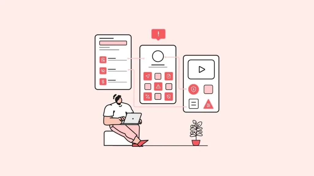
What Are Micro Interactions?
A micro interaction is a small, single-purpose response that happens when a user takes an action on a website.
The easiest way to understand them is through everyday life. When you press a lift button, it lights up. That light tells you: “Got it, I registered your press.” Micro interactions do the same thing on websites. They give users instant feedback so they always know what is happening.
They are not big or flashy animations. They are simple and subtle, like a color change, a small bounce, a progress bar, or a checkmark. Each one has a clear purpose and works quietly in the background.
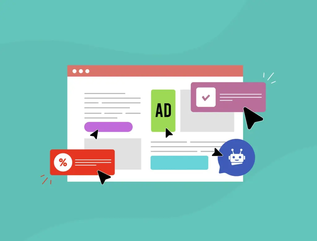
20 Micro-Interactions Examples for Web Design Inspiration
Here are micro interaction ideas organized by where they appear on a website. Each one is simple, practical, and used by real sites today.
Button Interactions
1. Hover color change:
The button shifts to a slightly different shade when the cursor moves over it. It signals the button is clickable without any text needed.
2. Press and shrink:
The button scales down just a touch when clicked. It mimics the feel of pressing a real physical button, which makes the action feel satisfying.
3. Loading spinner inside the button:
After clicking “Submit” or “Buy Now,” the button shows a small spinning icon instead of going blank. Users know the site is working on their request.
4. Icon slide-in:
A paper plane or envelope icon slides in from the side of the button after the form is sent. Adds personality and is easy to connect to the action visually.
5. Ripple effect:
A soft wave spreads outward from the point of click. It is a small touch that makes the click feel more physical and intentional.
Form and Input Interactions
6. Floating label:
When a user clicks into an input field, the placeholder text floats up and becomes a small label above the field. The field stays clean while still showing context.
7. Inline validation:
A tick or a cross appears next to each field as the user types. Users fix mistakes as they go instead of finding out at the end when they hit submit.
8. Password strength bar:
A bar below the password field fills up and changes color — red, orange, green — depending on how strong the password is. Simple and very useful.
9. Character counter:
As a user types in a text area, a small number shows how many characters remain. Common in social media style inputs and comment boxes.
10. Error shake animation:
If a required field is left empty or filled incorrectly, the field shakes left and right for a moment. It draws the eye without needing a long error message.
Navigation Interactions
11. Sliding underline on menu links:
Hover over a menu link, and a thin line slides in under it. It looks simple and clean. It makes the menu feel more interactive.
12. Smooth dropdown fade:
Instead of a sub-menu appearing instantly, it fades in with a soft transition. The difference is small but the feel is much more polished.
13. Active page dot or line:
A small indicator such as a dot, line, or highlight shows which page the user is on. It helps users understand their location, especially on larger sites.
14. Shrinking sticky header:
As the user scrolls down, the header reduces in height to take up less space. The page content gets more room without the header disappearing entirely.
15. Back to top button reveal:
A small arrow or button appears only once the user has scrolled a certain distance down the page. It stays out of the way until it is actually needed.
Content and Scroll Interactions
16. Like or heart animation:
When a user clicks a like button, the heart fills with color and pulses briefly. This is one of the most recognizable micro interactions on the web, used widely across social platforms.
17. Scroll progress bar:
A thin bar at the very top of the page fills from left to right as the user scrolls. On long blog posts, it tells readers how far through the content they are.
18. Image zoom on hover:
On e-commerce product pages, hovering over an image causes it to zoom in slightly. Users can inspect details without clicking into a separate view.
19. Toggle switch animation:
The switch slides from one side to the other with a smooth animation when turned on or off. Much clearer than a static checkbox for binary settings.
20. Notification badge pulse:
A small red badge on a bell or inbox icon pulses softly to signal new activity. It draws attention without being aggressive or distracting.
Best Practices for Using Micro Interactions
Getting micro interactions right is not just about adding motion. It is about making every small detail feel useful, natural, and fast.
Done properly, these tiny animations improve usability, guide users, and create a polished experience without getting in the way.
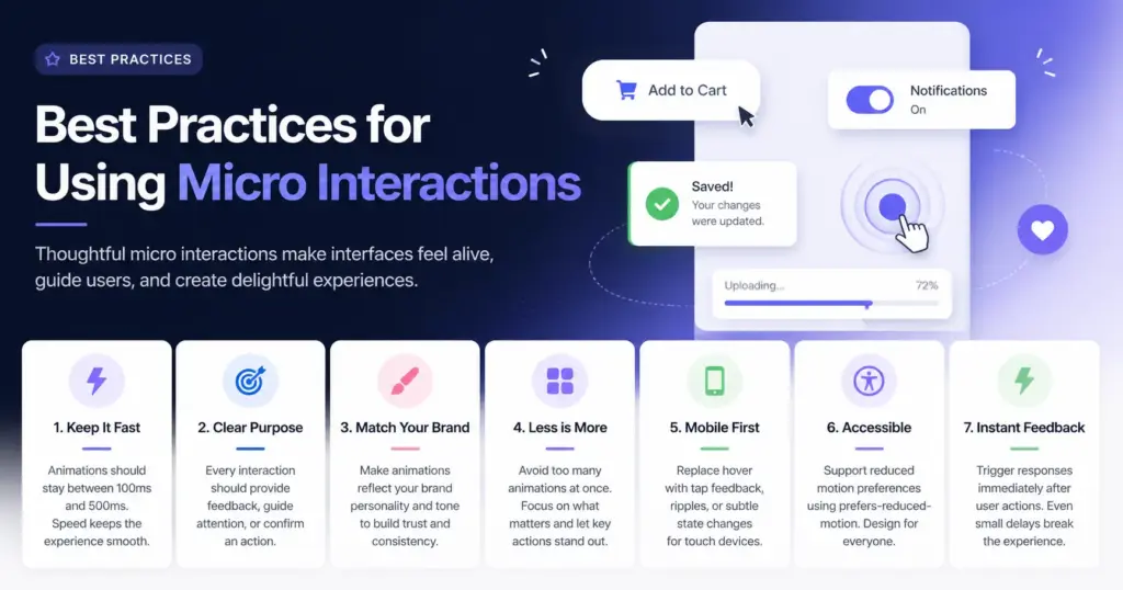
Keep animations short and responsive
Speed matters. Most micro interactions should stay between 100ms and 500ms. This range feels instant while still being noticeable. Anything longer can make the interface feel slow. Fast interactions keep the flow smooth and make the product feel lightweight and efficient.
Give every interaction a clear purpose
Every animation should do something meaningful. It should either provide feedback, guide attention, or confirm an action. If it does not serve one of these roles, it becomes noise. Unnecessary motion can confuse users instead of helping them.
Match your brand personality
Micro interactions are part of your visual identity. A fun and playful brand can use bouncy, energetic motion. A serious or professional product should lean toward subtle and minimal effects. Consistency between animation style and brand tone builds trust and makes the experience feel intentional.
Avoid too many animations at once
If everything moves, nothing stands out. Overusing animations creates visual clutter and distracts users from what matters. Use micro interactions selectively so they highlight key actions instead of competing for attention.
Design for mobile first
Many interactions like hover effects do not exist on touch devices. Think about how each interaction works on mobile. Replace hover with tap feedback, ripple effects, or subtle state changes so users still get clear responses on touchscreens.
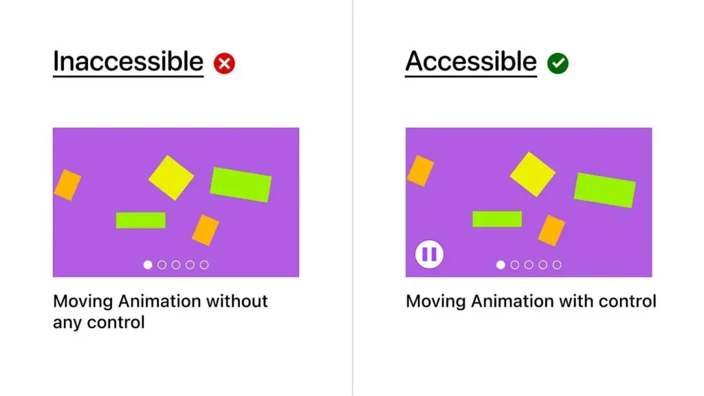
Respect accessibility preferences
Not all users are comfortable with motion. Some people experience discomfort with animations. Support reduced motion settings using CSS like prefers-reduced-motion. This ensures your product remains inclusive and usable for everyone.
Keep feedback immediate
Timing is critical. A user action should trigger an instant response. Even a small delay can make the interface feel broken. Micro interactions should start right after input to reinforce a sense of control and reliability.
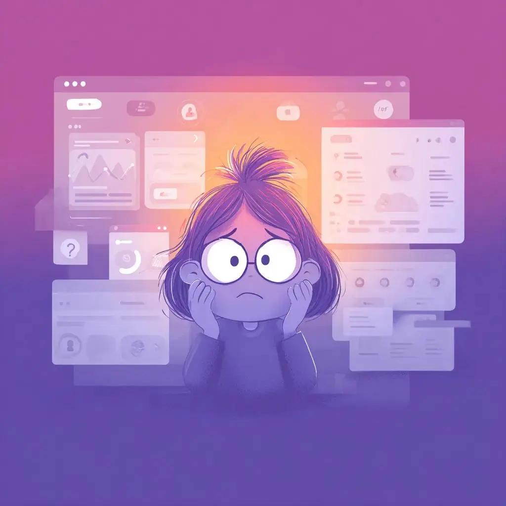
Common Mistakes to Avoid
Even well-designed micro interactions examples can fail if used incorrectly.
Micro interactions should improve clarity and flow, not distract or slow things down. Here are the most common mistakes and how to avoid them.
Animating Everything at Once
Too much motion creates chaos. A page where buttons, images, text, and icons all move at the same time feels overwhelming.
Instead of guiding the user, it pulls attention in every direction. Focus on key moments such as clicks, form inputs, and navigation changes. This keeps the experience clean and purposeful.
Making Animations too Slow
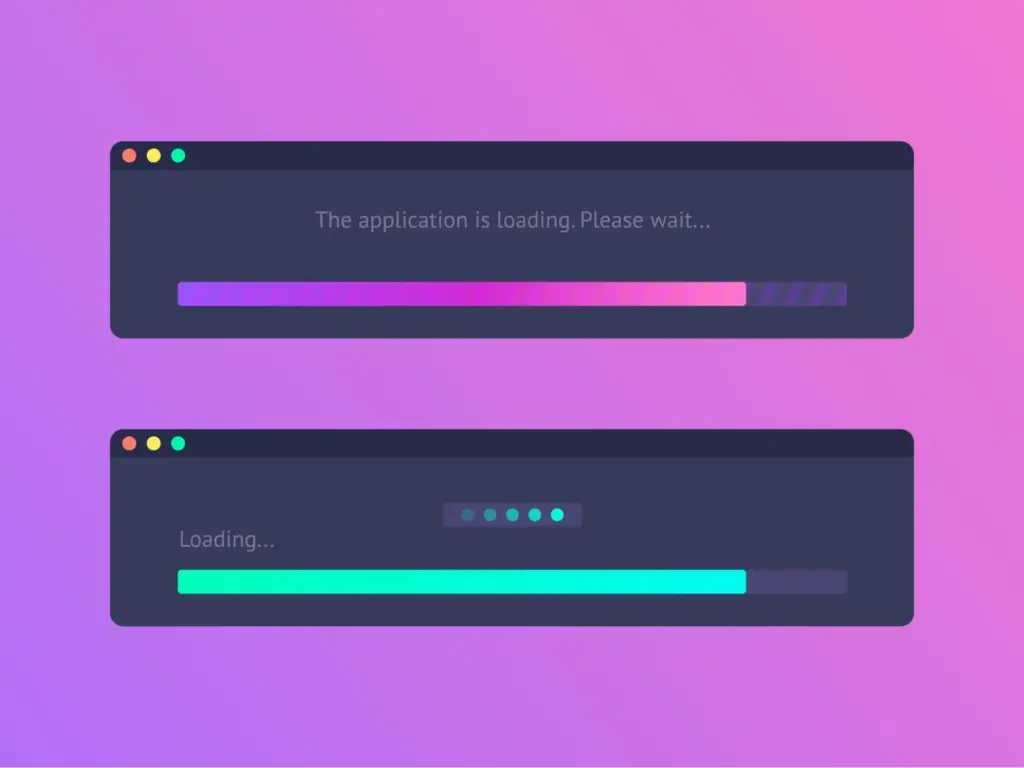
Speed directly affects how users feel about your product. Animations that take too long can feel like something is broken. A delay of even one or two seconds interrupts the flow and frustrates users. Keep interactions quick and snappy so the interface feels responsive and reliable.
Ignoring Performance Impact
Heavy animations can hurt performance, especially on lower-end devices. Complex effects, large assets, or poorly optimized code can cause lag and dropped frames. This makes the experience feel unpolished. Use lightweight animations, rely on CSS transforms and opacity, and avoid unnecessary JavaScript-heavy effects.
Forgetting Mobile Users
Many micro interactions are designed with desktop in mind, especially hover states. Touch devices do not support hover, so those interactions simply do not exist for mobile users. Always provide tap feedback, pressed states, or visual responses that work across all devices.
Adding Animation with No Meaning
Animation should communicate something. Decorative motion that does not provide feedback or guide attention quickly becomes noise. A bouncing headline or spinning icon might look interesting at first, but it adds no real value. Every interaction should help the user understand what is happening.
Overusing Attention-Grabbing Effects
Bright colors, large movements, and repeated motion can feel aggressive. These effects compete with your content and make it harder for users to focus. Use subtle animations most of the time and reserve stronger effects for important actions or alerts.
Ignoring Accessibility Needs
Not all users experience motion the same way. Strong or continuous animations can cause discomfort for some people. Ignoring accessibility settings makes your product less inclusive. Always respect reduced motion preferences and offer simpler alternatives.
Delayed or Unclear Feedback
Users expect instant confirmation after an action. If feedback is delayed or too subtle, users may think nothing happened and repeat the action. This can lead to confusion or errors. Clear and immediate feedback builds trust and makes interactions feel reliable.
Strong micro interactions ideas should always support usability, not distract from it.
Conclusion
Micro interactions are one of the most overlooked parts of web design. They are small, quiet, and easy to underestimate. But they are also the reason some websites feel smooth and others feel flat.
The 20 micro interactions examples in this post cover buttons, forms, navigation, and content — giving you a wide range of ideas to draw from no matter what kind of site you are building.
You do not need to add all of them at once. Start with the areas your users interact with most. A form field, a primary button, a sticky header. Add one interaction at a time and see how the feel of the page changes.
Small details leave a lasting impression. And in web design, the details are exactly where trust is built.
FAQs
What is a micro interaction in simple terms?
It is a small animation or visual response that happens when a user does something on a website. Examples include a button changing color on hover or a checkmark appearing after a form is submitted. They make sites feel more responsive and human.
Do micro interactions slow down a website?
Not when done correctly. Lightweight CSS animations have almost no impact on page speed. Problems only occur when animations are built with heavy JavaScript or too many are loaded at once. Always test performance after adding them.
Are micro interactions good for mobile websites?
Yes, but they need to be adapted for touch. Hover effects do not work on phones, so tap animations and transition effects become more important on mobile. Always check how your interactions behave on smaller screens.
How do I know which micro interactions to add to my site?
Start with the moments your users interact with most, such as your main call to action button, your contact form, and your navigation. These are the most important places to begin. From there, add interactions where they truly help users understand what is happening.
Leave a Reply