Have you ever landed on a website and thought, “Wow, that looks amazing”?
Chances are, animation played a big role in that experience.
Modern websites are no longer static. Thoughtful motion helps guide users, highlight important content, and make everything feel more engaging.
That’s why designers and developers constantly explore new website animation examples — not just to make things look good, but to improve usability and interaction.
Here are 32 website animation examples and effects that will spark ideas, help you understand what each one does, and show you why they work so well.
What Are Website Animation Effects?
Website animation effects are visual movements that happen on a webpage. They can be triggered when a page loads, when a user scrolls, or when someone clicks or hovers over an element.
You’ll often see these in modern web page animation examples, where motion is used to guide users naturally through content.
There are many different website animation effects names, but they all share a common goal — making a website more engaging, interactive, and easier to understand.
Good animation for websites is not just about decoration. It helps users focus, understand interactions, and move smoothly through a page.
Why Website Animations Matter
Website animations help grab attention, make your site look more professional, explain ideas faster, and improve user experience by guiding visitors clearly.
They Make Visitors Stop Scrolling
Most people scan a page in a few seconds. An animation that plays as they scroll gives them a reason to pause and pay attention. That pause can be the difference between a bounce and a conversion.
They Make Your Site Feel Professional
Subtle motion often separates average designs from polished ones. That’s why many of the best web animations focus on clarity and smoothness rather than complexity.
They Help Communicate Ideas Faster
Animation can explain ideas instantly. This is one of the reasons designers look for web animation inspiration before building modern interfaces.
They Improve User Experience
Good animations are not just pretty — they are functional. Loading indicators, hover effects, and micro-interactions tell users what is happening on a page. That clarity reduces confusion and builds trust.
Let’s explore website animations and example effects in detail in the next section.
32 Cool Website Animation Examples and Effects
Below is a curated list of practical and cool website animations you can use in real projects.
These are proven animation examples for websites that designers rely on for both creativity and usability.
Whether you’re searching for web animation examples or exploring 50 animation ideas for client projects, this list will give you a strong starting point.
Scroll-Triggered Animations
These animations play as the user scrolls down the page. They are some of the most popular and effective web animation effects used today.
1. Fade In on Scroll:
Text or images appear as you scroll into view. Simple, clean, and widely used. It makes content feel like it is being revealed rather than just existing.
In this example, the text appears as you scroll into view.
2. Slide Up on Scroll:
Elements slide upward into position as you reach them. Adds a sense of momentum and flow to the page.
3. Slide In from Left or Right:
Content comes in from the sides as you scroll. Works great for comparisons or feature sections.
4. Stagger Animation:
Text elements appear one by one in sequence instead of all at once. This creates a smooth, organized flow and makes content easier to read.
5. Parallax Scrolling:
Background images move slower than the foreground, creating a layered depth effect. One of the most iconic web animation examples used on portfolio and product sites.
6. Zoom In on Scroll:
An image or card gently scales up as it enters the viewport. Draws attention without being distracting.
7. Pinned Section Animation:
A section stays fixed on screen while you scroll, and content inside it animates. Great for storytelling pages.
Hover Animations
These animations respond to mouse movement. They are a great way to make interactive elements feel alive.
8. Button Hover Fill:
A button fills with color when you hover over it. Gives clear visual feedback that it is clickable.
9. Card Lift on Hover:
Cards rise slightly when hovered, as if being picked up. Makes a grid of cards feel interactive and tactile.
10. Text Underline Animation:
A line draws under a menu link on hover. Much more satisfying than a static underline.
11. Icon Rotation on Hover:
An icon spins or rotates when hovered. Works well for social icons or feature icons.
12. Color Shift on Hover:
An element shifts to a different color when hovered. Simple but effective for guiding attention.
13. Magnetic Button Effect:
A button slightly follows the cursor as it gets close. Feels playful and modern — common on creative agency sites.
14. Border Draw on Hover:
A border draws itself around a card or button when hovered. Clean and minimal.
These are simple but effective website animation ideas for designers who want quick improvements.
Page Load Animations
These animations play when a page first loads. They set the tone for the whole experience.
15. Text Split Animation:
A heading splits into individual letters or words and animates in. High-impact for headlines.
16. Preloader Animation:
A short animation plays while the page loads. Reduces perceived wait time and keeps users engaged.
17. Typewriter Effect:
Text appears one character at a time, like someone typing. Works well for taglines and headlines.
18. Line Draw Animation:
SVG lines draw themselves on page load. Common for logo animations and illustrated sections.
Micro-Interactions
These are small, functional animations that respond to user actions. They make a website feel responsive and human.
19. Toggle Switch Animation:
A switch slides smoothly on/off when clicked. Feels satisfying to interact with.
20. Tooltip Fade In:
A small tooltip fades in when hovering over an icon. Gives helpful context without cluttering the UI.
21. Loading Spinner:
A spinner rotates while a process is running. Tells users something is happening, so they do not think the site is broken.
These are often part of the best web animations because they directly improve user interaction.
Advanced and Creative Animations
These are bolder effects used on creative portfolios, agency sites, and product pages.
22. Horizontal Scroll Section:
Instead of scrolling down, content scrolls sideways in a section. Feels fresh and unexpected.
23. 3D Card Tilt on Mouse Move:
A card tilts in 3D as the mouse moves over it. Creates an immersive, tactile feel.
24. Cursor Follower:
A custom cursor or circle follows the mouse around the screen. Common on creative and portfolio sites.
25. Image Reveal on Hover:
Hovering over a section or text element reveals a hidden image with a smooth transition. A signature effect on modern creative and portfolio sites.
26. Video Background with Text Overlay:
A looping video plays in the background while text animates over it. Cinematic and high-impact.
27. Lottie Animation Integration:
Lightweight, illustrated animations play inline on the page. Adds personality without slowing load times.
28. Scroll-Driven Story Animation:
An illustration or diagram animates step-by-step as you scroll. Perfect for explaining complex ideas visually.
29. FLIP Card Transition:
An element flips — position, size, or shape — and GSAP’s FLIP technique animates the transition smoothly between states. Works well for interactive card reveals and state changes.
30. Blur-to-Sharp Text Reveal:
Text starts blurry and comes into sharp focus as it enters view. Subtle, elegant, and effective on minimal or high-end design styles.
These techniques are often used as cool animation ideas in portfolio and agency websites.
Image Animations
Image Animations enhance your website’s visual appeal by adding smooth, engaging motion that captures attention and improves user experience.
31. Image Scale Up on Scroll:
Images scale from smaller to their full size as they enter view. Creates a sense of depth in otherwise flat layouts.
32. Parallax Image Scroll:
The image moves at a slightly different speed than the surrounding content as the user scrolls, creating a layered depth effect.
Where These Animations Are Used
You will find these web page animation examples across many types of websites, each serving a specific purpose beyond just visual appeal.
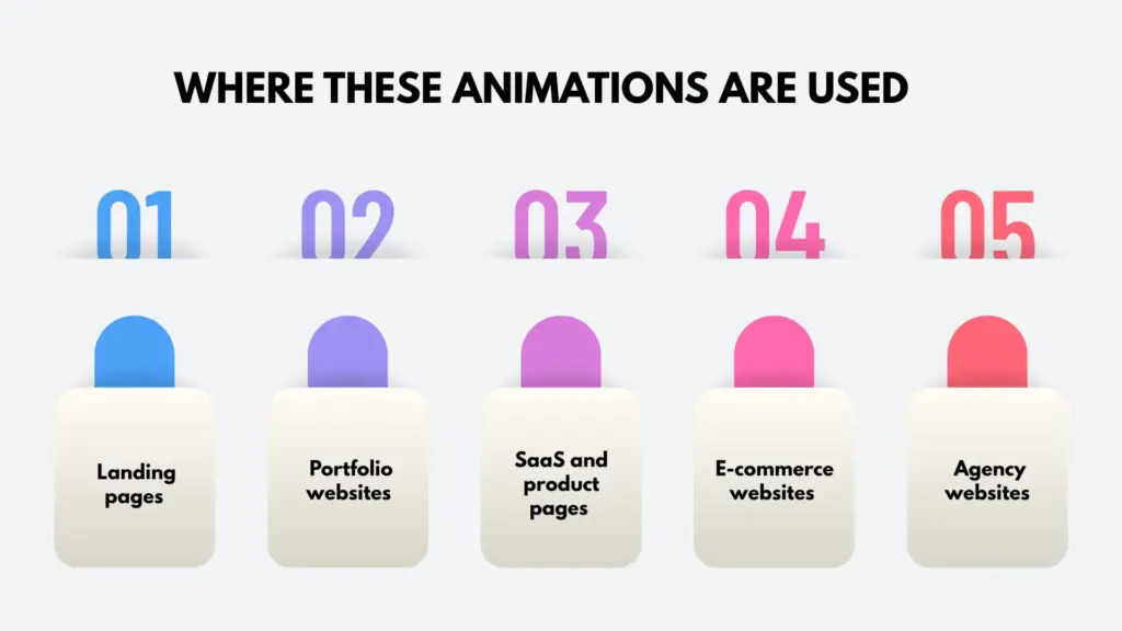
Landing pages
Use subtle motion like fade in sections and scroll based reveals to guide attention step by step. This creates a natural flow, helping visitors stay focused and increasing the chances of conversion.
Portfolio websites
Rely heavily on interactive effects such as hover reveals, cursor interactions, and smooth page transitions. These animations make the work feel more polished and give a strong impression of creativity and professionalism.
SaaS and product pages
Use animations to explain complex ideas in a simple and engaging way. Effects like counters, typewriter text, and scroll driven storytelling help users quickly understand features without feeling overwhelmed.
E-commerce websites
Benefit from animations that improve product interaction. Image zoom, hover swaps, and card lift effects make browsing more engaging and help users feel more confident before making a purchase.
Agency websites
Often use advanced motion such as parallax scrolling, full screen transitions, and split layouts. These animations showcase the agency’s design capability and create a memorable first impression.
In all cases, the goal is not just to make the website look good, but to improve usability, guide user behavior, and create a smoother and more engaging experience.
Best Practices for Using Web Animations
Web animations work best when they are simple, helpful, and used with care.
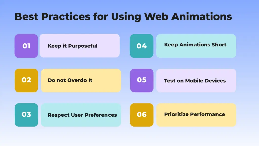
Keep it Purposeful
Every animation should have a clear job. It can guide attention, give feedback, or tell a small story. If it does nothing useful, it can distract users and make the page feel messy.
Do not Overdo It
Too many animations can feel confusing and noisy. Try to use only one or two strong effects in each section. This keeps the page clean and easy to follow.
Respect User Preferences
Some people feel uncomfortable with too much movement. It is important to respect their needs. You can make animations optional so users can enjoy the site in a way that feels safe for them.
Keep Animations Short
Good animations are quick and smooth. Most should last less than one second. If they are too slow, users may feel the site is lagging.
Test on Mobile Devices
Animations may look good on a big screen but not on a small one. Always check how they work on phones and tablets to make sure everything feels smooth and fast.
Prioritize Performance
Heavy animations can slow down your website. Use simple effects and optimized images so your site loads fast and runs well for everyone.
Common Mistakes to Avoid in Animation
Using animations the wrong way can make your website feel slow, confusing, and hard to use.
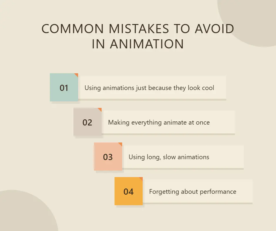
Using animations just because they look cool
Animations that serve no functional purpose distract visitors rather than helping them. Always ask: what does this animation do for the user?
Making everything animate at once
When every element is moving, nothing stands out. Stagger your animations and give each one space to breathe.
Using long, slow animations
Animations that take more than a second to complete feel like they are wasting the visitor’s time. Keep them snappy.
Forgetting about performance
Too many animations running at once can make a page feel slow and clunky. This hurts both user experience and SEO.
Conclusion
Animations are one of the most powerful tools in modern web design. The right website animation examples can transform a simple layout into an engaging experience.
From subtle transitions to advanced interactions, these animation examples for websites offer endless possibilities. If you’re exploring new ideas or looking for website animation ideas for designers, there is always something new to try.
The key is to stay intentional. Focus on usability first, and use animation to support your content — that’s what turns simple designs into truly cool website animations.
FAQs
What are website animation effects?
Website animation effects are visual movements on a webpage that are triggered by scrolling, clicking, hovering, or page loading. They are used to guide attention, give feedback, and improve the overall user experience.
Do website animations affect SEO?
They can, but only if implemented poorly. Heavy or slow animations can hurt page speed, which impacts SEO rankings. Lightweight, well-coded animations have little to no negative effect and can improve engagement metrics, which helps SEO.
Which website animations are best for beginners?
Fade-in on scroll, button hover effects, and counter animations are great starting points. They are simple, widely used, and have a noticeable impact without being too complex.
How many animations should I use on one page?
There is no fixed number, but a good rule of thumb is: less is more. Use animations to highlight important sections rather than animating everything. A page with three or four well-placed animations will almost always look better than one where everything is moving.
Leave a Reply