
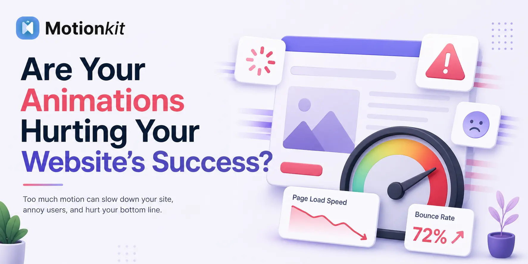
Animations can make a website feel alive. A smooth scroll, a button that reacts on hover, or a section that fades in can instantly make a page feel more engaging.
But there is something many people miss. Too much animation or poorly used effects can quietly hurt your website. Pages can become slow, users can lose focus, and important content can get buried under movement. Everything may still look impressive, but the experience can feel frustrating.
This is why modern websites are moving away from flashy effects and focusing on meaningful website animation. The goal is not to impress users, but to guide them and make the content easier to understand.
In this guide, you will learn how to spot when animation is helping or hurting your site, and how to use it in a way that improves both performance and user experience.
Signs Your Website Animations Are Hurting Performance
It is very easy to get excited about animations and slowly add more than your website actually needs.
Over time, these additions can start affecting performance and user experience in ways that are not immediately obvious.
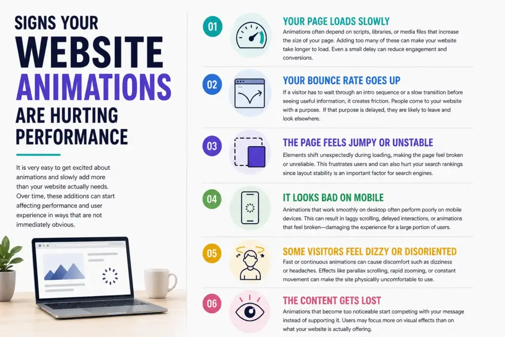
Your Page Loads Slowly
Animations often depend on scripts, libraries, or media files that increase the size of your page. Adding too many of these can make your website take longer to load.
Most users expect a page to load within a few seconds. If it takes longer, many visitors leave before interacting with your content. Even a small delay can reduce engagement and conversions. Heavy animation files, complex JavaScript, or multiple effects running together can delay how quickly your content becomes visible and usable.
Your Bounce Rate Goes Up
Users who land on your page and leave almost immediately are often facing a problem. In many cases, that problem is unnecessary animation.
If a visitor has to wait through an intro sequence or a slow transition before seeing useful information, it creates friction. People come to your website with a purpose. If that purpose is delayed, they are likely to leave and look elsewhere.
The Page Feels Jumpy or Unstable
A common issue caused by animation is when elements shift unexpectedly during loading. This creates a sense of instability that makes the page feel broken or unreliable.
For example, a user might try to click a button just as it moves because an animation finishes loading. Text sections may shift position as images or effects appear. This not only frustrates users but can also negatively impact your search rankings since layout stability is an important factor for search engines.
It Looks Bad on Mobile
Animations that work smoothly on powerful desktop devices often perform poorly on mobile phones. Mobile devices have less processing power and often operate on slower networks.
This can result in laggy scrolling, delayed interactions, or animations that feel broken. Since a large portion of users browse on mobile devices, poor animation performance in this context can significantly damage the overall experience.
Some Visitors Feel Dizzy or Disoriented
Not all users experience motion the same way. For some people, fast or continuous animations can cause discomfort such as dizziness or headaches.
Effects like parallax scrolling, rapid zooming, or constant movement in the background can make the site physically uncomfortable to use. Ignoring this means excluding a portion of your audience from comfortably accessing your content.
The Content Gets Lost
Animations that become too noticeable start competing with your message instead of supporting it.
Users may focus more on visual effects than on what your website is actually offering. In these cases, the animation becomes a distraction rather than a tool. The goal of a website is communication, and anything that weakens that communication becomes a problem.
How to Avoid Animations Hurting Your Website
Most animation-related issues come from a few common mistakes. Once you understand them, fixing your website becomes much easier.
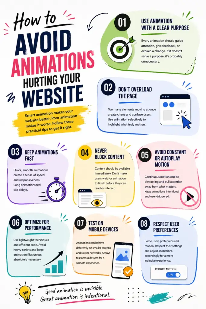
Use Animation With a Clear Purpose
Every animation should have a reason to exist. It should guide attention, provide feedback, or help explain a change on the screen.
If an animation is only there to make the design look more interesting, it is often unnecessary. Purpose-driven animation improves usability, while decorative animation often creates a distraction.
Don’t Overload the Page
Too many elements moving at the same time make it hard for users to focus. The page starts to feel chaotic instead of engaging.
A cleaner approach is to use animation selectively. Highlight only important interactions or sections. This creates contrast and makes each animation feel meaningful instead of overwhelming.
Keep Animations Fast
Speed plays a major role in how users perceive your website. Animations that take too long feel like delays, even if they look smooth.
Short and responsive animations create a sense of immediacy. They make the interface feel fast and interactive, which improves overall user satisfaction.
Never Block Content
Content should always be accessible immediately. Users should not have to wait for the animation to finish before they can read or interact.
Animation that delays access to information can create frustration. The best approach is to show content instantly and use animation only to improve how it is presented.
Avoid Constant or Autoplay Motion
Continuous movement can become distracting. Constant motion on the screen makes it harder for users to focus on what matters.
Animations should feel controlled and intentional. If something keeps moving without user interaction, it often becomes more annoying than helpful.
Optimize for Performance
Lightweight animation techniques are always preferable. Simple transitions and efficient rendering methods can achieve great results without slowing down your website.
Heavy scripts and large animation files should be avoided unless absolutely necessary. The smoother your site performs, the better the user experience will be.
Test on Mobile Devices
Testing on mobile is essential. An animation that feels perfect on a desktop might behave completely differently on a smaller device.
You should always check how animations perform across different screen sizes and network conditions. This ensures consistency and reliability for all users.
Respect User Preferences
Some users prefer reduced motion, and modern systems allow them to set this preference.
A well-designed website respects these settings and adjusts animations accordingly. This creates a more inclusive experience and ensures that your site remains comfortable for everyone.
When Animations Actually Work Well
Animations are most effective when they feel natural and almost invisible to the user. Instead of trying to impress, they should quietly support the experience by guiding attention, confirming actions, and making interactions smoother.
Used with intention, animation becomes more than just a visual effect. It turns into a useful tool that helps guide users, improve clarity, and make the overall experience easier to follow.
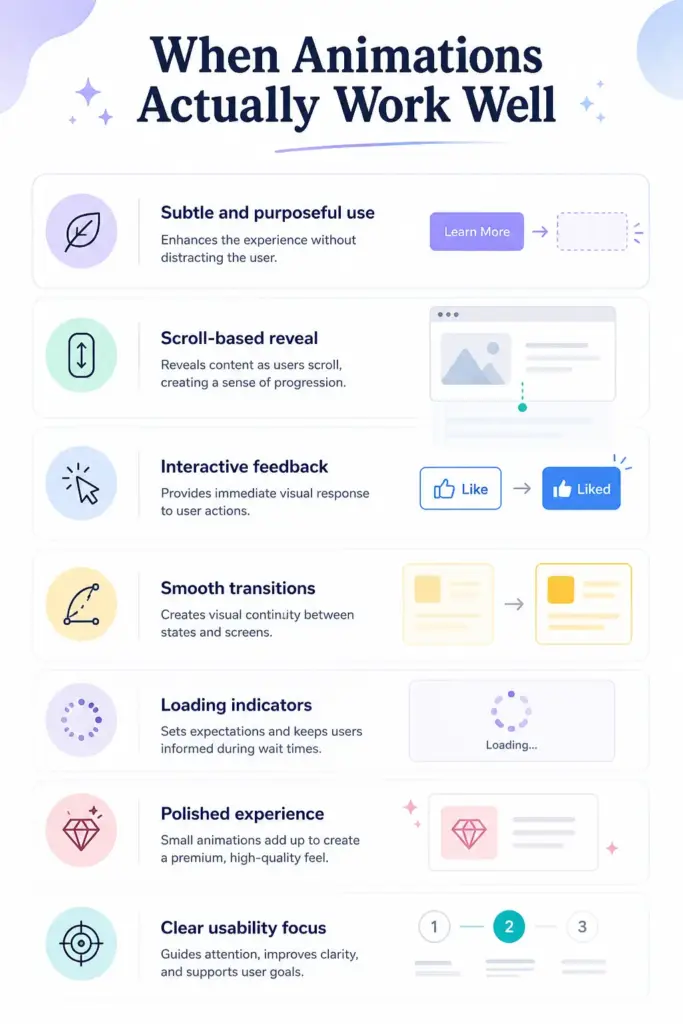
Subtle and purposeful use
Animations should support the experience without drawing unnecessary attention. Every movement needs a clear purpose, such as guiding focus or improving understanding. Overuse can distract users, so keep animations simple and intentional.
Scroll-based reveal
Sections that appear as users scroll help control how content is consumed. This creates a natural reading flow and prevents users from feeling overwhelmed by too much information at once. It also keeps users engaged as they move through the page.
Interactive feedback
Buttons and elements should respond instantly on hover or click. This confirms that an action has been recognized, which builds trust and makes the interface feel responsive and easy to use.
Smooth transitions
Changes between sections or pages should feel natural, not sudden. Smooth transitions help users understand that one state is changing into another, creating a more connected and comfortable browsing experience.
Loading indicators
When content takes time to load, visual feedback such as loaders or progress indicators reassures users. It lets them know the system is working, which reduces frustration and prevents them from leaving the page.
Polished experience
Small animation details can improve how professional a website feels. Even subtle effects can make the design look modern and refined, helping users form a positive impression of your brand.
Clear usability focus
Animations should always improve clarity and structure. They should highlight important elements, guide navigation, and support content instead of competing with it.
Conclusion
Animations are neither good nor bad on their own. Their impact depends entirely on how they are used and where they are applied on a website. Thoughtful use can improve usability, guide attention, and make the overall experience feel smooth and engaging.
On the other hand, careless use can slow down performance, distract users from important content, and reduce clarity. Too much motion or poorly timed effects can quickly turn a good design into a frustrating one.
The solution is not to remove animation completely but to use it with intention. Focus on keeping animations fast, simple, and meaningful. Every movement should serve a clear purpose. Test your website on different devices and screen sizes, and always think about how real users will experience it.
The best animations are the ones that feel natural and helpful, often so subtle that users do not notice them directly, but still benefit from them.
FAQs
Can animations affect my Google rankings?
Yes, animations can influence your Core Web Vitals, especially when they affect loading speed or cause layout shifts. Poor performance in these areas can lower your rankings over time.
How do I know if my animations are slowing my site down?
You can use tools like Google PageSpeed Insights or Lighthouse to analyze your website. These tools highlight performance issues and often reveal whether animations are contributing to slower load times.
What kind of animations are safest to use?
Simple and lightweight animations are generally the safest choice. Subtle effects like hover feedback, small transitions, and gentle fade-ins improve usability without causing performance or accessibility issues.
Is it okay to have no animations at all?
Yes, it is completely fine. Many high-performing websites use minimal or no animation at all. Simplicity often leads to better performance and clearer user experiences.
Leave a Reply